
EXPLORATION / BRAND IDENTITY & LOGO DESIGN / JULY 2026
PROJECT OVERVIEW
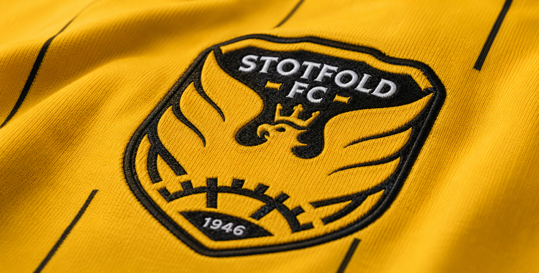
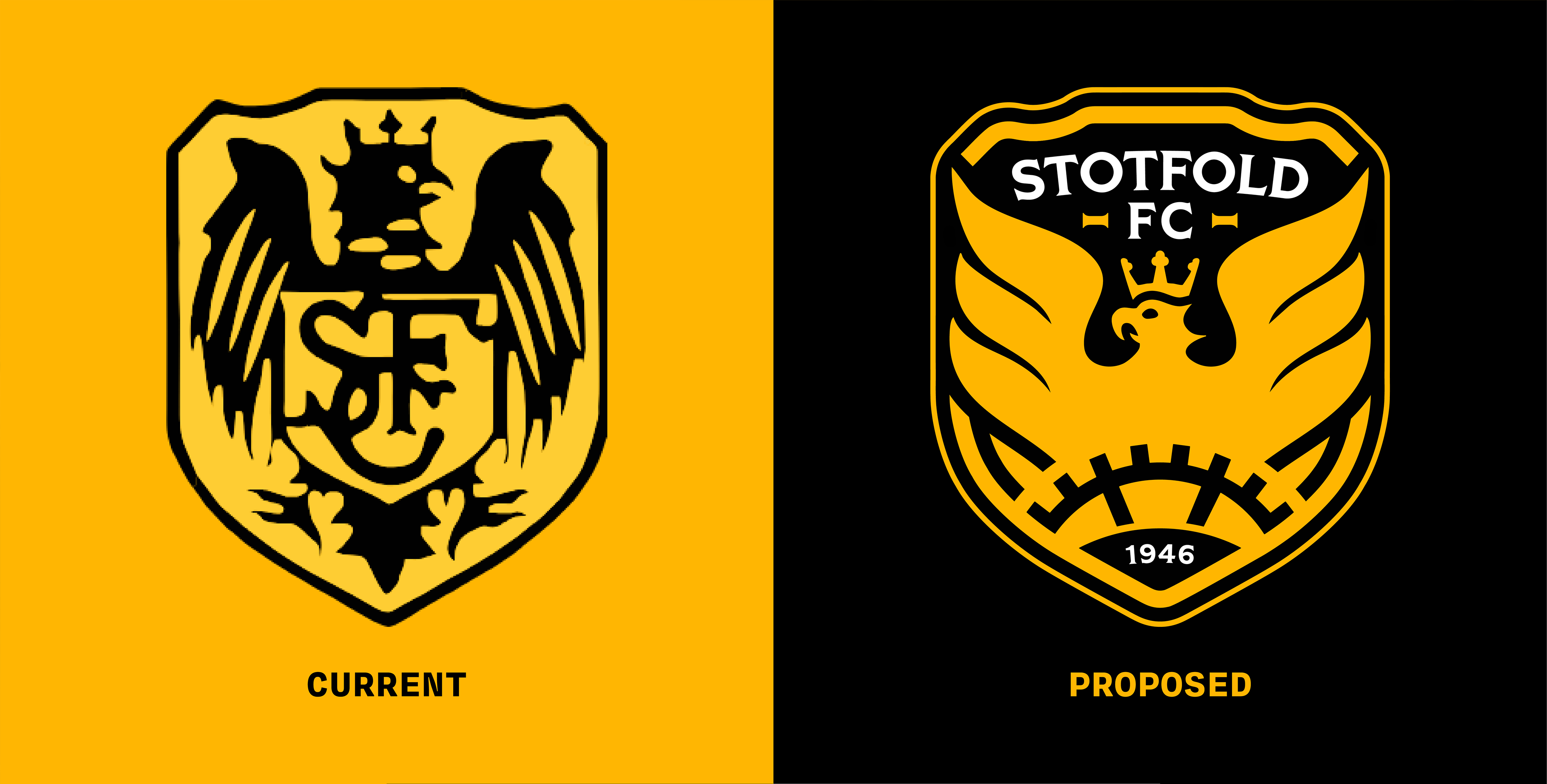
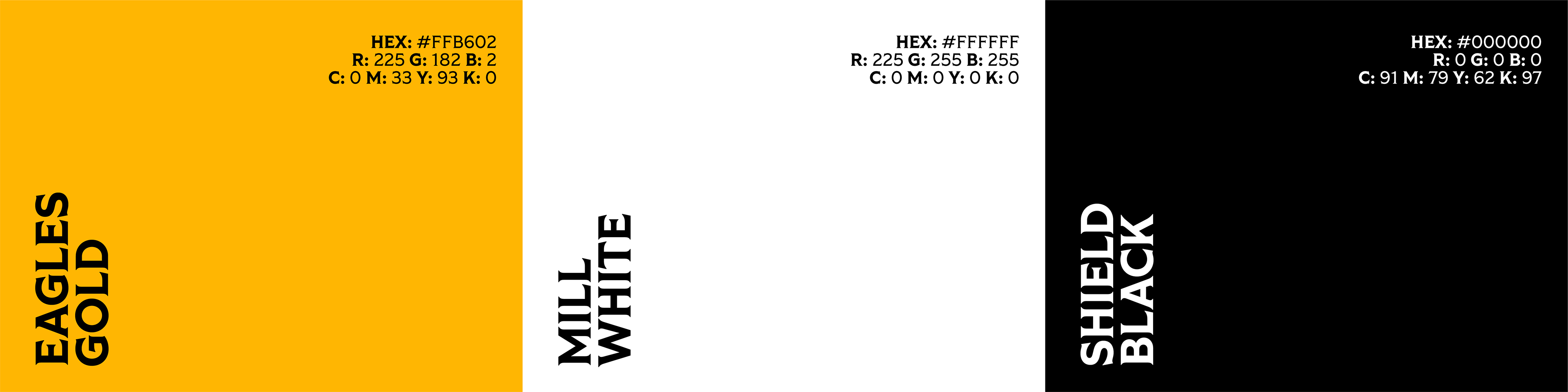
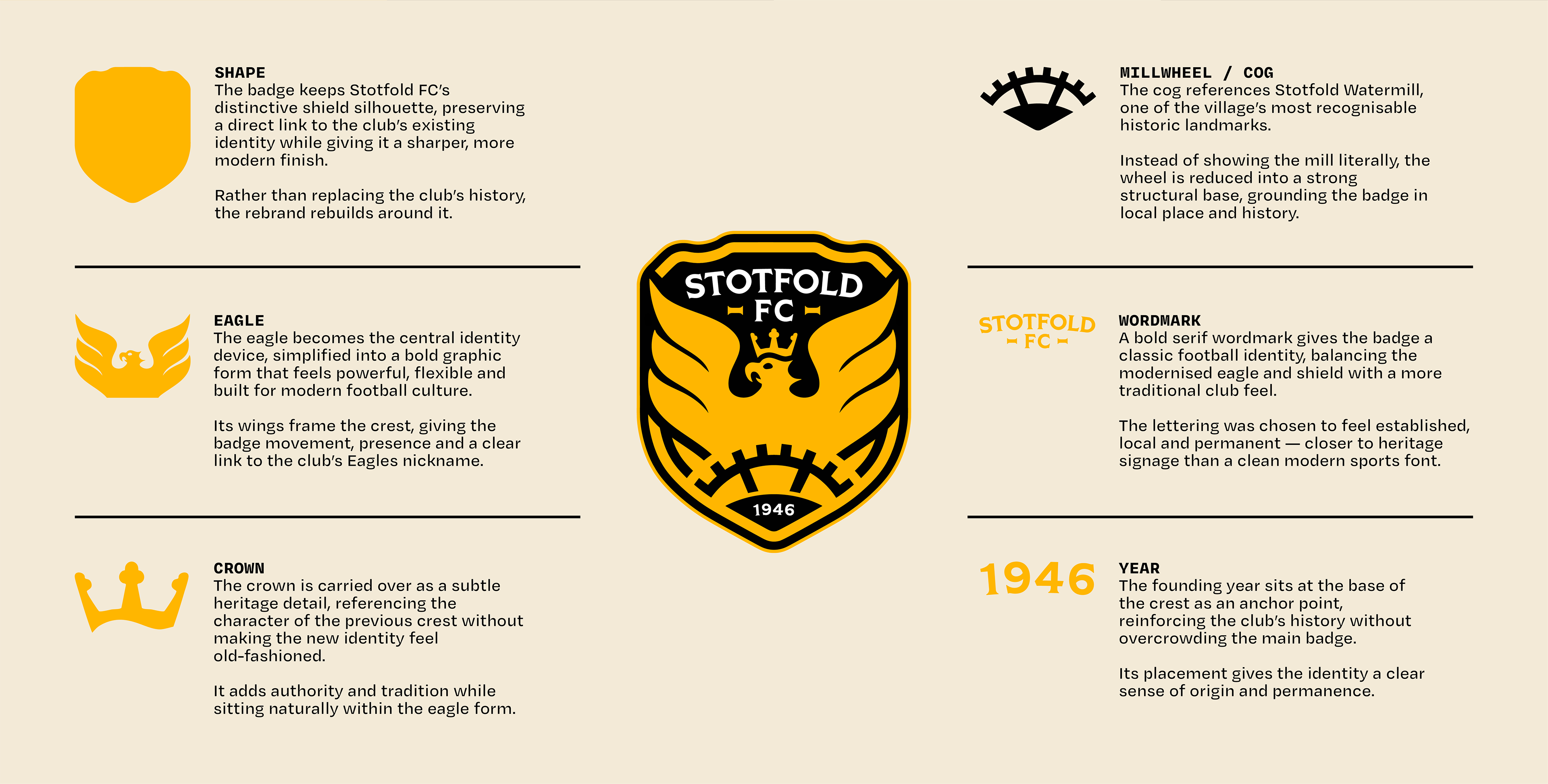
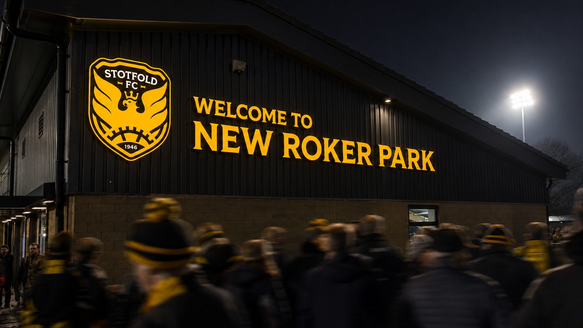
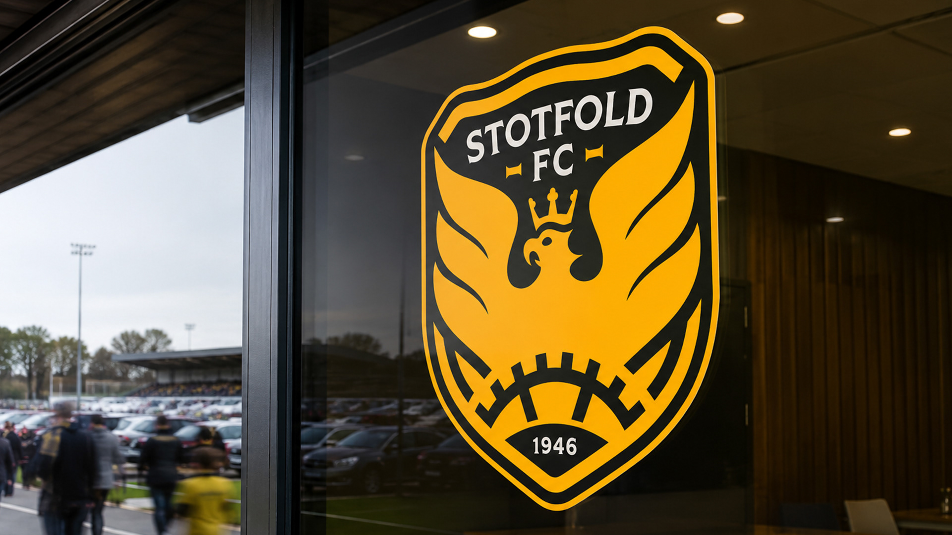
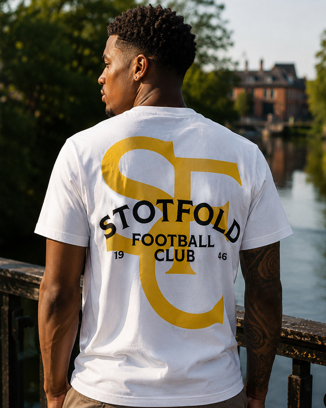
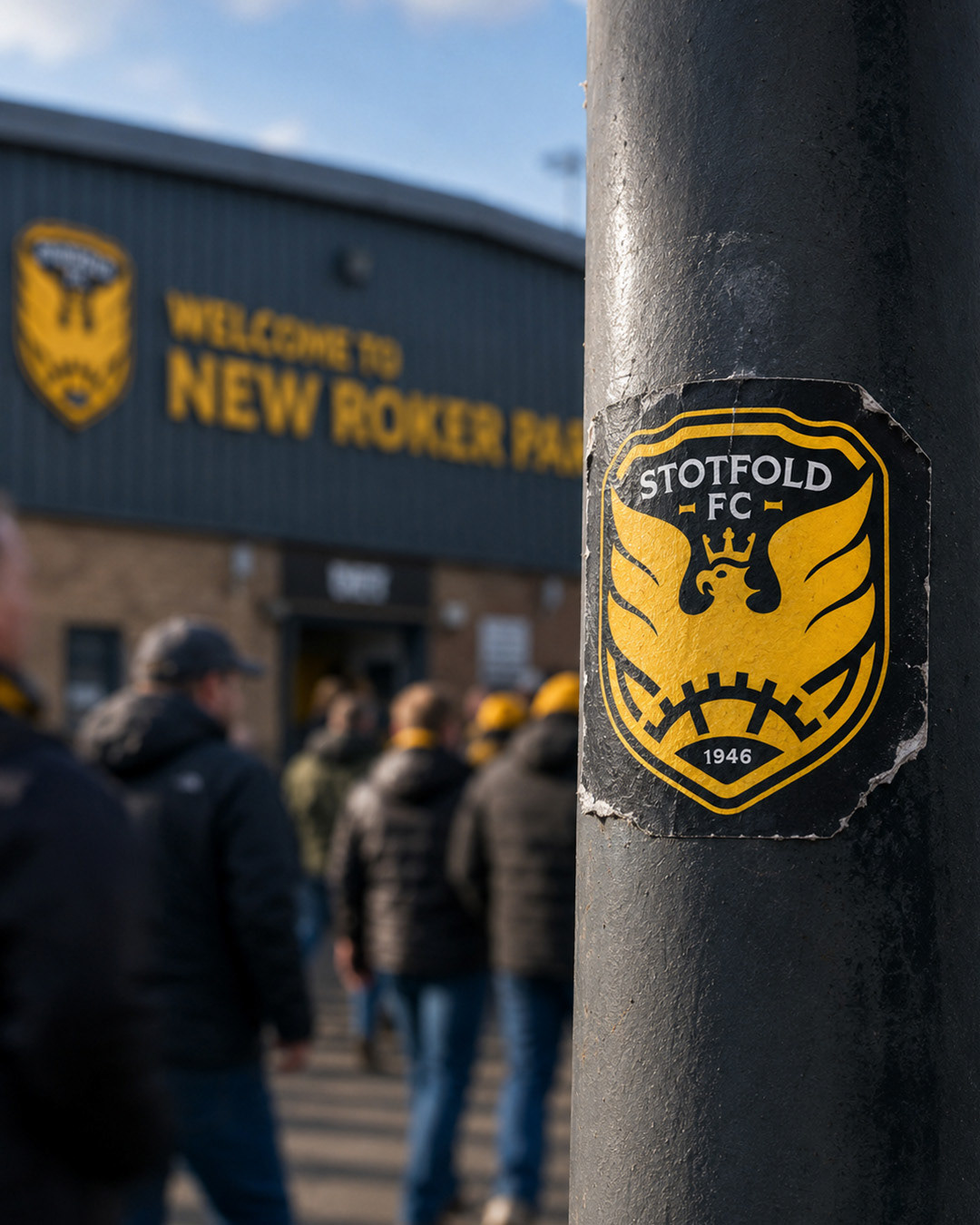
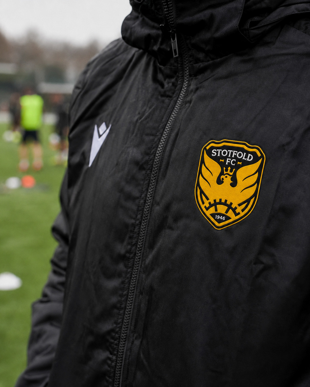
This independent exploration reimagines Stotfold FC’s crest and wider visual identity while protecting the elements that already belong to the club: the shield, the eagle, the black-and-gold palette and its connection to local history.
The intention was not to create another polished modern badge that could belong to any football club. It was to build something unmistakably Stotfold — stronger in character, sharper in execution and more distinctive wherever it appears.
The identity is shaped by three central ideas: the eagle as the club’s defining symbol, the mill wheel as a reference to Stotfold Watermill, and the town name’s historic association with stables and enclosed land.
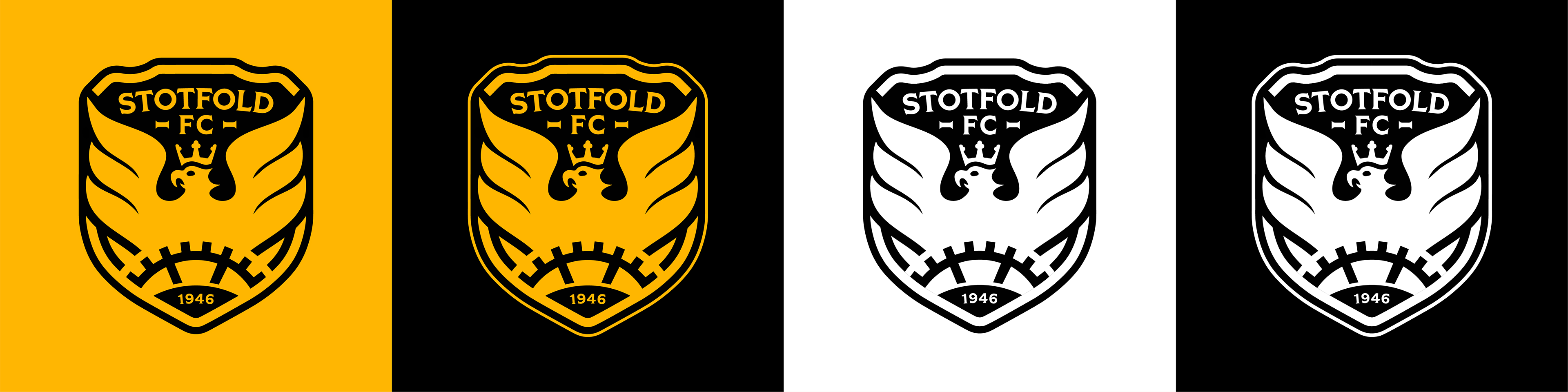
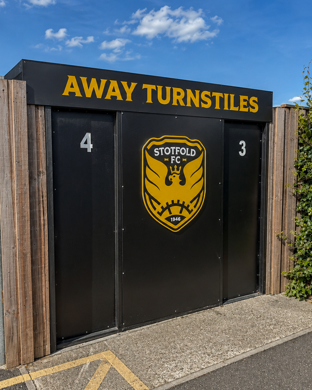
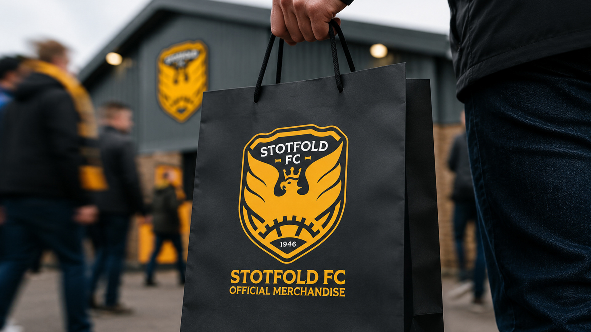
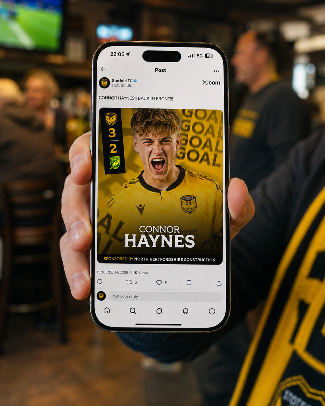
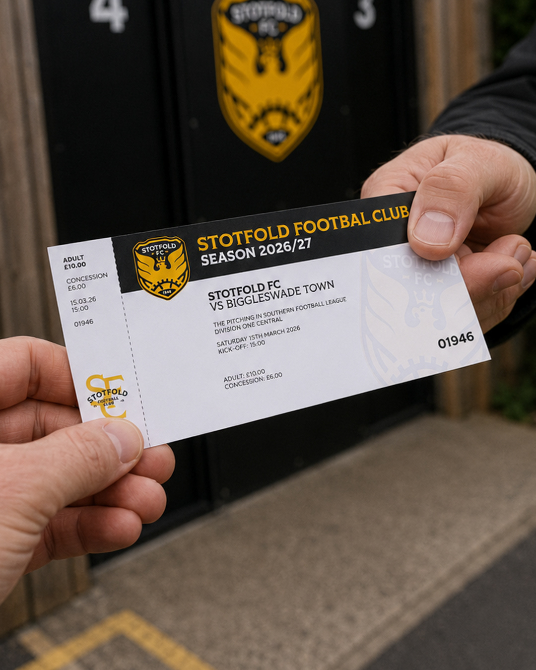
These elements come together in a modernised crest designed to work confidently across shirts, signage, merchandise, digital content and supporter culture.
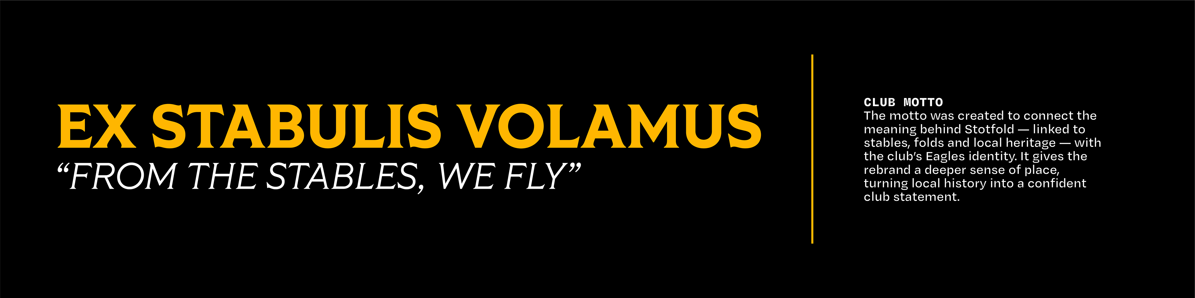
A new Latin motto, EX STABULIS VOLAMUS — “From the stables, we fly” — connects the meaning behind Stotfold’s name with the club’s eagle identity, giving the concept a clear and ownable expression.
PROJECT GOAL
To build a distinctive club identity rooted in Stotfold — one with more character, more local meaning and greater impact across every application.




LET'S BUILD WHAT COMES NEXT.
Planning a new identity, campaign or website? Work directly with Half Turn Studio to create something distinctive, coherent and built to last.